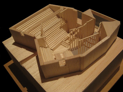
Model (1:100):
 View from King st
 View from Lennox St
Drawings:
 Sheet 1: plans
 Sheet 2: sections
The perspective drawings did not scan well so here are photos of the drawings:
 The Gallery front when viewed from the street and beyond the glass panel
 The play of light in the main gallery space
 The mezzanine
 The small exhibition space and use of hollow columns
Chosen Site: Site 1
Clients: ArtExpress

Clients: ArtExpress

After conducting research into the 'essence' of Newtown, i was determined to choose ArtExpress as my client because both the suburb and community of artistic youth, strove for tolerance.
As one tourism website declared, "You can be whoever you want to be in Newtown", it is evident that Newtown accepts and celebrates difference. In the same way, ArtExpress desires to enhance understanding among the public. In the 2008 exhibition theme of "Australian Beauty", many works challenged accepted notions of beauty so as to encourage a break from mainstream thought and find the value in everything.
Design of Gallery Front
 The design for my gallery front integrates 3 main ideas.
However the modernity of the building will still be apparent through the choice of material. Utilising window film on glass (see High Performance Window Films) it will appear on the street as a large graphic sign announcing ArtExpress. Its semi-transparent nature will also entice the public to explore the building as they can capture a glimpse of the forms behind the glass panel.
Meanwhile when viewed from within the gallery, the public will be able to enjoy views of King St as the window film is entirely transparent from the opposite direction.
 3) The appreciation of a warm public guesture. King St is incredibly long and so abundant with rich, individual shops that an experience in the suburb can actually be highly exhausting. Yet there are rare places to stop and rest - the mood remains busy, the tempo fast. Thus this cafe immediately caught my eye with its cosy and friendly offering. In the same way I desire my Art Gallery to present the public with a welcoming guesture so that it can act as a refuge against the hectic city, and a place which proudly serves the people.

Sketch of proposed street facade: deceptively simple through the horizontality (which acts as a graphic sign and maintains the urban fabric) and offering of public seats.
 Model representation. View from King St.
 Sketch of the gallery facade hidden behind the glass panel: the real nature of the building is complex, rich and diverse but hidden by 'supposed simplicity'.
 Model representation. Richness is conveyed through the play with light, layering of forms and contrasting curvilinear vs rectilinear elements.
Meanwhile the room which projects out on the second floor is open to the public as a multimedia/internet hub. It can also be booked by classes which visit the Art Gallery for excursions. The room is essential to the gallery considering the modern interrelationship between technology and art; not only has technology redefined the very notion and purpose of art, but also artmaking and role of the audience. Through technology, modern viewers are granted great flexibility and power in responding to and shaping art.
As the public approach the entrance to the gallery, they will see students discussing and researching on computers in the multimedia room. This immediately tells them that the purpose of the Art Gallery extends beyond displaying works - it also desires to encourage public involvement, so that people become part of the artistic experience and form their own understanding of art.
Foyer:
 In contrast to the busy entrance and gallery facade, the foyer upholds simplicity. Light is emitted through the frosted glass in the external wall (located behind the public seats).
Large Gallery Space
 My main inspiration was I.M.Pei's Eastern Wing at the National Gallery of Washington. I was fond of a few features and translated them into my design:
 Sketch of the main gallery design. The curves introduced in the gallery front continue through the curved roof. A sense of monumentality is achieved through the great expanse of walls and prominent openings.


The change in materials to timber walls and marble floors is to achieve a more sensual experience. Triangulated light projects down on the two platforms so as promote an energetic atmosphere which encourages the public to stop there and observe the scene, or discuss with one other.
Artworks will be hung on the walls while large installations can fill the central space.
Mezzanine
 Sketch of the mezzanine revealing sources of light.

In the main gallery there are 2 sets of stairs and both lead to the mezzanine which wraps around the back of the gallery. The stairs on the left lead to the multimedia room, while the stairs on the right lead around to the semi-private and private spaces. The function room and apartment respectively.
Function Room
 The function room will be used for celebrations such as an opening night and therefore will only be accessible in the evening. It is encased by glass walls which grants views over both the Main Gallery space and courtyard. However the public will not be observing artworks alone, as human activity is integral to the energy of the space. Art is not defined as objects alone, but instead encompasses the presence and actions of people.
Courtyard: (encompasses apartment and workshops)
 Another source of inspiration was Louis Kahn's Yale Centre for British Art due to the great expanse of walls composed of beautiful materials, and sense of layering framed views. Thus i transferred over to my design the same monumental walls and openings which frame human actions.


The public will be drawn immediately from the main gallery space into the courtyard due to the abundant sunlight and open space. As the Art Gallery encourages discussion, the steps which lead down to the courtyard also operate as seats for rest and talk.

The change in materials in the courtyard symbolises the use of masonry and all the rooms behind the masonry wall receive Northern sunlight. The bottom floor consists of workshops which can be booked by students or artists who don't have their own studio spaces. With windows elevated 2m above the courtyard ground level, passerbys will not disturb their concentration and yet if the public stands a distance away, they can observe their work like a moving artwork. Once again human actions are inseparable from the notion of art. The small doors on the bottom floor lead to the bathrooms.
Meanwhile the upper storey consists of a public kitchen (which is easily accessible for function events) and private apartment. The apartment enjoys unrestricted views as the wall located opposite and on the site boundary, is only 2m high.
Small Exhibition Spaces:

 The public area ends with small exhibition spaces. Intimacy is achieved through the low ceiling height of 2.8m and timber walls. Light is admitted into the room through Kahn's 'hollow columns' and once again vitality is promoted in the space through the triangulated light.
 Meanwhile the private area encompasses the ramp which leads up to the delivery and storage rooms. Furthermore there are stairs which lead upstairs to the office.
 View of Art Gallery from Lennox St. Bottom floor contains the storage and delivery room. Upstairs is a large studio space and office.
Covered Seating Area:

In most galleries, the public is supposed to leave immediately after viewing the works. Therefore seats aim only to cure momentary tiredness, rather than welcoming long periods of rest. However by valuing human presence and participation, this Art Gallery presents a final resting place which permits the public to stay as long as they like. Reflection and discussion of the artworks is again encouraged. The triangulated shading system continue the curves from the gallery front so that it flows through the structure. Meanwhile the 1m high baluster enables the public to restore their connection to the context. Previously the high walls of the gallery deprived the public of views of the surrounding, so that they were lost in an alternate, artistic world.
The last room is a large studio space for group work.
Final Exhibition Space
 Sketch showing how Northern sunlight reflects off the wall and onto artworks located in niches in the wall
 This is the final space within the Art Gallery where the gradual ramp leads back up to the foyer. Overhead is the mezzanine floor and to the right are a series of niches. The smaller spaces are for displaying artworks while the two larger spaces serve as seats so as to again promote public discussion.
As one tourism website declared, "You can be whoever you want to be in Newtown", it is evident that Newtown accepts and celebrates difference. In the same way, ArtExpress desires to enhance understanding among the public. In the 2008 exhibition theme of "Australian Beauty", many works challenged accepted notions of beauty so as to encourage a break from mainstream thought and find the value in everything.
Design of Gallery Front
 The design for my gallery front integrates 3 main ideas.
1) The Deception of Simplicity. Newtown shops bear humble and plain facades which disguise the richness hidden within. The suburb is actually highly eclectic with each shop bearing strong, individual character.
2) Yet the eclectic shops are integrated through the continuation of prominent horizontal lines. Therefore as i desire my Art Gallery to sit harmoniously within the urban fabric, i will maintain the rectilinear forms.
2) Yet the eclectic shops are integrated through the continuation of prominent horizontal lines. Therefore as i desire my Art Gallery to sit harmoniously within the urban fabric, i will maintain the rectilinear forms.
However the modernity of the building will still be apparent through the choice of material. Utilising window film on glass (see High Performance Window Films) it will appear on the street as a large graphic sign announcing ArtExpress. Its semi-transparent nature will also entice the public to explore the building as they can capture a glimpse of the forms behind the glass panel.
Meanwhile when viewed from within the gallery, the public will be able to enjoy views of King St as the window film is entirely transparent from the opposite direction.
 3) The appreciation of a warm public guesture. King St is incredibly long and so abundant with rich, individual shops that an experience in the suburb can actually be highly exhausting. Yet there are rare places to stop and rest - the mood remains busy, the tempo fast. Thus this cafe immediately caught my eye with its cosy and friendly offering. In the same way I desire my Art Gallery to present the public with a welcoming guesture so that it can act as a refuge against the hectic city, and a place which proudly serves the people.
Sketch of proposed street facade: deceptively simple through the horizontality (which acts as a graphic sign and maintains the urban fabric) and offering of public seats.
Model representation. View from King St. Sketch of the gallery facade hidden behind the glass panel: the real nature of the building is complex, rich and diverse but hidden by 'supposed simplicity'.
 Model representation. Richness is conveyed through the play with light, layering of forms and contrasting curvilinear vs rectilinear elements.
Meanwhile the room which projects out on the second floor is open to the public as a multimedia/internet hub. It can also be booked by classes which visit the Art Gallery for excursions. The room is essential to the gallery considering the modern interrelationship between technology and art; not only has technology redefined the very notion and purpose of art, but also artmaking and role of the audience. Through technology, modern viewers are granted great flexibility and power in responding to and shaping art.
As the public approach the entrance to the gallery, they will see students discussing and researching on computers in the multimedia room. This immediately tells them that the purpose of the Art Gallery extends beyond displaying works - it also desires to encourage public involvement, so that people become part of the artistic experience and form their own understanding of art.
Foyer:
 In contrast to the busy entrance and gallery facade, the foyer upholds simplicity. Light is emitted through the frosted glass in the external wall (located behind the public seats).
Large Gallery Space
 My main inspiration was I.M.Pei's Eastern Wing at the National Gallery of Washington. I was fond of a few features and translated them into my design:
1) The vitality achieved by triangulated light. It captures the energy of youth and encourages active public participation within the gallery
2) The monumental openings which allow the public to observe human activity, so that the viewers of artworks contribute to the notion of Art.
3) The monumentality of the mezzanine achieved through its simple but defined form
4) The great sense of open space
2) The monumental openings which allow the public to observe human activity, so that the viewers of artworks contribute to the notion of Art.
3) The monumentality of the mezzanine achieved through its simple but defined form
4) The great sense of open space
 Sketch of the main gallery design. The curves introduced in the gallery front continue through the curved roof. A sense of monumentality is achieved through the great expanse of walls and prominent openings.

The change in materials to timber walls and marble floors is to achieve a more sensual experience. Triangulated light projects down on the two platforms so as promote an energetic atmosphere which encourages the public to stop there and observe the scene, or discuss with one other.
Artworks will be hung on the walls while large installations can fill the central space.
Mezzanine
 Sketch of the mezzanine revealing sources of light.
In the main gallery there are 2 sets of stairs and both lead to the mezzanine which wraps around the back of the gallery. The stairs on the left lead to the multimedia room, while the stairs on the right lead around to the semi-private and private spaces. The function room and apartment respectively.
Function Room
 The function room will be used for celebrations such as an opening night and therefore will only be accessible in the evening. It is encased by glass walls which grants views over both the Main Gallery space and courtyard. However the public will not be observing artworks alone, as human activity is integral to the energy of the space. Art is not defined as objects alone, but instead encompasses the presence and actions of people.
Courtyard: (encompasses apartment and workshops)
 Another source of inspiration was Louis Kahn's Yale Centre for British Art due to the great expanse of walls composed of beautiful materials, and sense of layering framed views. Thus i transferred over to my design the same monumental walls and openings which frame human actions.

The public will be drawn immediately from the main gallery space into the courtyard due to the abundant sunlight and open space. As the Art Gallery encourages discussion, the steps which lead down to the courtyard also operate as seats for rest and talk.

The change in materials in the courtyard symbolises the use of masonry and all the rooms behind the masonry wall receive Northern sunlight. The bottom floor consists of workshops which can be booked by students or artists who don't have their own studio spaces. With windows elevated 2m above the courtyard ground level, passerbys will not disturb their concentration and yet if the public stands a distance away, they can observe their work like a moving artwork. Once again human actions are inseparable from the notion of art. The small doors on the bottom floor lead to the bathrooms.
Meanwhile the upper storey consists of a public kitchen (which is easily accessible for function events) and private apartment. The apartment enjoys unrestricted views as the wall located opposite and on the site boundary, is only 2m high.
Small Exhibition Spaces:
 The public area ends with small exhibition spaces. Intimacy is achieved through the low ceiling height of 2.8m and timber walls. Light is admitted into the room through Kahn's 'hollow columns' and once again vitality is promoted in the space through the triangulated light.
 Meanwhile the private area encompasses the ramp which leads up to the delivery and storage rooms. Furthermore there are stairs which lead upstairs to the office.
 View of Art Gallery from Lennox St. Bottom floor contains the storage and delivery room. Upstairs is a large studio space and office.
Covered Seating Area:

In most galleries, the public is supposed to leave immediately after viewing the works. Therefore seats aim only to cure momentary tiredness, rather than welcoming long periods of rest. However by valuing human presence and participation, this Art Gallery presents a final resting place which permits the public to stay as long as they like. Reflection and discussion of the artworks is again encouraged. The triangulated shading system continue the curves from the gallery front so that it flows through the structure. Meanwhile the 1m high baluster enables the public to restore their connection to the context. Previously the high walls of the gallery deprived the public of views of the surrounding, so that they were lost in an alternate, artistic world.
The last room is a large studio space for group work.
Final Exhibition Space
 Sketch showing how Northern sunlight reflects off the wall and onto artworks located in niches in the wall
 This is the final space within the Art Gallery where the gradual ramp leads back up to the foyer. Overhead is the mezzanine floor and to the right are a series of niches. The smaller spaces are for displaying artworks while the two larger spaces serve as seats so as to again promote public discussion.


 Meanwhile the north is situated on a cliff edge with unrestricted sunlight and views. Her room is located there, with a more intimate heigh level of 3m as opposed to 5m+ so she doesn't feel intimidated and overwhelmed by the space. She is reconnected with the outside world and can seek both relaxation and inspiration.