Day 1, 5th December
 We instantly got to know the other members of our culturally diverse Taxi Group; Malaysian Edwin and Italian Alarico! Whilst Alarico is missing in this photo, Mei snapped an awfully handsome pose of him somewhere else in the garden :D
Day 2: 6th December
 Whilst the water and hand crafted mountains were spectacular sights, i soon realised my fetish for walls and shadows!! This was my favourite photo from the day - a portal from the dark depths of solitude, to finally unveil the golden hues of the garden.
Day 3: 7th December
 The notion of Feng Shui is evident through the thoughtful, balanced composition which establishes harmony between the different elements of water, land, natural and built forms.
Day 4: 8th December
 The sunshine disappeared from Suzhou! However the dreary weather had little effect on the enthusiasm and inventiveness of Alarico and Jason :)
Day 5: 9th December
 Catching a taxi is too difficult in Suzhou, especially in wet weather during peak hours! It was also the perfect excuse to risk our young lives on bike/taxi vehicles :) The narrow road meant we hardly rode along side each other and therefore i have only a fleeting snapshot of Alarico! (with Mei beside him)
Day 6: 10th December
 My wall fetish continues!! Instead of light and shadow effects, the rainy weather highlighted a diverse palette of colours and textures. The eroded facades evoked a mystical sense of time and my appreciation for how the presence of Ancients lingers to this day.
Day 7: 11th December
 If the hues were green/black, it would look like something out of the Matrix! The 5-star stay was even more exciting because i wasn't aware the Grand Hyatt was located in the Jinmao tower - a building i had researched and discussed in an essay last year! It felt very much like a dream come true :)
Day 8: 12th December
 Ethan, a Shanghai local, took us out for dinner and shopping :) Yet at midnight we still weren't satisfied!! So with an additional visit to food markets (a very different & risky experience compared to Department Store eating), JJ, Jabez, Mei, Ethan & I had an additional late-night snack.
Day 9: 13th December
 Heading out for dinner on the coldest day yet! However we soon discovered that fat jackets not only keep you warm, but erase the gender of its wearers!!
So take a guess: Which one is Wen (the 5th year Male) and which is Mei (the 2nd year Female)?
Day 10: 14th December
 The Finale!! After a 1.5hr back massage (with heavy discounts because they were new and we were students), we settled for a 2am McDonalds snack and then 4hrs of Karaoke. In this photo there are actually 4 people sleeping - can you tell who? :D
 View from King st


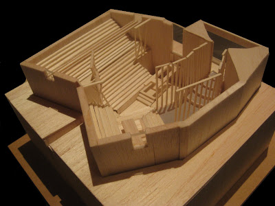
 Meanwhile the north is situated on a cliff edge with unrestricted sunlight and views. Her room is located there, with a more intimate heigh level of 3m as opposed to 5m+ so she doesn't feel intimidated and overwhelmed by the space. She is reconnected with the outside world and can seek both relaxation and inspiration.